
The many sides of Saint Joan – Sarah Chou on how she represented the play.
Good theatre poster design looks like it’s creation was effortless if the designer has done their job right but a lot of work and forethought happens behind the scenes. Take the process of creating U of A Studio Theatre’s poster design as a case study. The Fine Arts communications office often engages with designers from Art & Design course DES 593/594 to create our promotional artwork. Sarah Chou was one of this year’s UAlberta Bachelor of Design graduates collaborating with us this theatre season and she graciously agreed to share her design process for the poster which was selected to promote Studio Theatre’s 2013 production of Saint Joan by George Bernard Shaw.
I asked Sarah a few questions to start exploring the steps that encompass her design process.
What is the first thing you do when you are posed with a design problem?
The first thing I do when facing a design problem is breaking down the brief and defining what the audience is and what kind of tone I would like to achieve.
Where do your ideas come from (spring from)? Do you do research, or do ideas just come to you?
Sometimes ideas come to me when I am being briefed on the project, but usually I have to do some research and look at inspiration online.
I initially do some research and find similar projects and look at how the problem has been solved previously.
Do you sketch things out or get right onto the computer?
Usually I scan my sketches and try to digitize my concepts. From there I play with the concepts on the computer and print out mock-ups. Throughout the process I look for advice on how it is turning out and whether I am headed in the right direction.
Do you collaborate with others a lot on your design process at any point in time?
Throughout my process I like describing my concepts to others, whether they are my professors or classmates, or just a friend. From there, I gather their thoughts and opinions and see what works well.
How do you communicate with the people you are creating a design solution for? How do you coax the right information out of them? How do you like to introduce your solutions to them?
I start with reiterating the brief and talking about the points that I chose to push forward with. I ask questions that would help in my design and try to get them to elaborate with what they like and don’t like about the design.
You can see first-hand how these steps of her process were used in the poster design case study: Saint Joan.
Saint Joan Case Study
Client: Studio Theatre
Project Title: Saint Joan by George Bernard Shaw
Duration: Two Months
Description:
Create a poster for Studio Theatre’s newest production: Saint Joan, and carry on this imagery for a full suite of marketing materials.
Research:
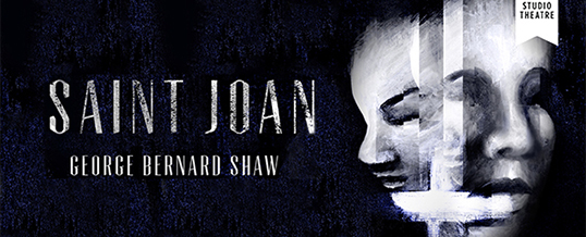
I initially looked at what the story of Joan of Arc was all about, and compared it with the brief. The director, Micheline Chevrier, described her production as exploring Joan’s identity in a dramatic and mysterious way. The client (Terah Jans, Fine Arts Marketing Specialist) posed the question: who is Joan of Arc? After speaking with Terah and asking various questions involving what kind of tone and imagery is used in the play and what the requirements were, the direction I chose to push forward was playing with the duality of Joan as a naïve, young woman, and a spiritual warrior.
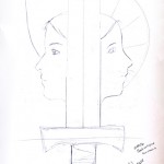
I chose to go with a composition of two sides of a face to push this idea forward. I also wanted to divide the two with a sword that also resonated with a cross.
Challenges:
The biggest challenge was coming up with a design that embodied the play, without seeing the actual play beforehand. I then needed to decided how to execute my concept in a balanced composition and include all the necessary text.
Strategy:
I started to look at different kinds of poster design and portraits and searched for the style I wanted to go with. I brought it over to the computer to create something more concrete than my sketches using vectors in Adobe Illustrator. However, it turned out too minimalist and did not portray the correct tone that the brief had asked for. I had shown this mock-up to the client and received feedback, noting that the concept was strong, but it lacked the draw that she was looking for. Thus, I continued to search for examples of portraits and collaging different kinds of styles together to see what I could come up with.
I created a composition that I liked and decided that painting the illustration would provide the proper tone I was looking for. I sketched the composition out and created two or three versions until I reached the correct texture and contrast. I then scanned the image in very high resolution onto the computer and brought it into Photoshop. Here I could edit the image, add effects, and layer the image to create a transient atmosphere.
Now that I had the image ready, I needed to choose the correct font. I find that sometimes the font choice is what makes or breaks a project. After testing out various choices, I came across Tommasso, a font that has hints of Medieval to tie in with the time frame of this play, yet modernized to keep the poster from looking too dated. I set the rest of the text and positioned the logos. To make the text and image look cohesive, I used a texture on the main title to resonate with the texture of the image. After receiving feedback from my client and the professor, I refined the type and cleaned up the image some more to end up with my final result.
Results:
George Bernard Shaw’s Saint Joan investigates Joan’s internal struggle and dichotomy of her identities as a spiritual warrior and a naïve young woman. I chose to push this theme in my imagery by painting two sides of Joan, split in-between by a sword that also references a cross. Using a dark background with a high contrast image emphasizes the dramatic emotional intensity of the play. Joan is lit in bright white, using layers to create a transient and spiritual feeling in her portrait. Having the image appear out of the darkness also adds a mysterious tone to the poster. The main title is set in a font with slight undertones of medieval churches. The rough texture laid on top reinforces the grittiness of the tragedy.
After the director and TJ chose this design, I continued to execute it across all other marketing materials used in the campaign.


Sarah created a full-suite of marketing materials based on her design. These included print ads, posters, a large-scale outside banner and a number of web ads.
Her design for Saint Joan as well as other work can be see on her site www.sarahchou.ca
~TJ
![]() Previous articleHalcyon DaysNext article
Previous articleHalcyon DaysNext article![]() Forgiveness in The Last Days of Judas Iscariot
Forgiveness in The Last Days of Judas Iscariot