
Introducing our redesigned, revamped and rejuvenated Curious Arts blog
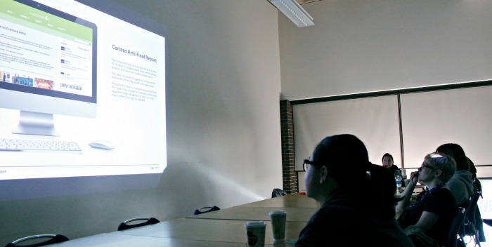
This week, TJ and I are proud to reveal our reimagined Curious Arts blog! The fresh new look and organization of the site is the result of a collaboration throughout the 2014 winter term with the brilliant students in Sue Colberg and Kevin Zak’s Des 594: The Practice of Graphic Design classes at the University of Alberta.
As a class assignment, senior-level undergraduate design students conducted a design/usability audit with Curious Arts. It can be difficult for the creators of a website to see objectively how the interface works for the users of the site. An audit compares your website against usability best practices and can show you what’s working and what’s not. We were eager to tap into a focus group of UAlberta creatives, the very people the blog is built for, to give us feedback on what they liked and what we could do better.
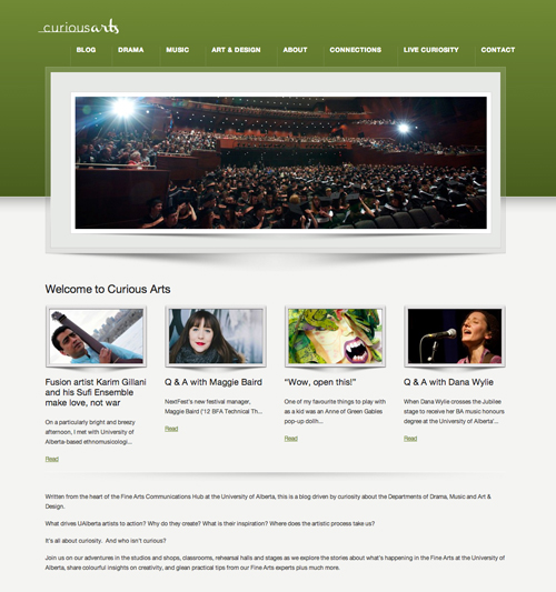
Our “before” screen cap of the site.
How was information organized? Was it easy to find what they were looking? What changes would they suggest?
The design students scoured the site, weighing in on everything from the readability of our typography choices, to copy line lengths, image sizing, and inconsistencies with story layout.
We discussed what colour palette was most appealing to them, considering that the site should reflect the University of Alberta’s visual identity and also allow for the colourful vibrancy of UAlberta fine arts to shine through.
Most importantly, we wanted to find out: What are they curious about?
The students responded by curating examples of creative sites they regularly look to for inspiration: Man Repeller. Fonts in Use. Into the Gloss. Refinery 29. Ad Goodness. Design Work Life. The Design Blog. Hypebeast
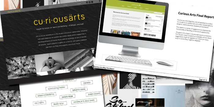
A collage of final reports submitted from the students of Des 594.
They shared ideas about what topics, themes and series they would like to see explored, such as more industry advice from alumni, more emphasis on featured event previews and more show and tell of creative work in-progress and behind the scenes. Together, we imagined how we could tell those stories best.
Over the summer, Terah worked hard to synthesize what we gleaned from the students to complete a redesign of the site.
What’s new and improved on Curious Arts?
Simple, Scrolling and Clean:
-black and white with punches of the University of Alberta’s secondary palette
-dominance of imagery to speak to the vibrancy of UAlberta creative activity
-more interaction between text and imagery
Inquisitive User Experience:
-no separation by discipline, instead clearer story categories and tagging by topic have been implemented
-many options for clicking content at the top level
-increased touchpoints with institutional site
-rich variety of short and long form reading, images, and video
Emphasis on Engagement:
-social media buttons in top right corner
-integration of Instagram into our curiosity-driven storytelling
-ways to submit/contribute more obvious and user-friendly
-comments posted in real time
-bigger spotlight on contributors
Over the coming weeks, we will continue to re-tag older posts, iron out any kinks and make refinements based on feedback from readers. We’ll introduce our new contributors and begin to regularly refresh the page with a steady stream of new content.
We’d love to hear what you think about our new Curious Arts. The blog will continue to be a creative work in progress throughout the 2014-15 fine arts season. Be curious with us.
![]()
![]() Previous article#Unbored at the Edinburgh Fringe FestivalNext article
Previous article#Unbored at the Edinburgh Fringe FestivalNext article![]() Great-Gatsby-esque garb for The Violet Hour
Great-Gatsby-esque garb for The Violet Hour